Direction + Design
Matthew Novak has had the privilege to work alongside some of the industry’s most talented people and work for and with some of the world’s coolest brands. Through that time, he has been lucky enough to lead teams of up to 30 as well as work solo, to product campaigns and content. Below you’ll find recent work that he has produced, both as an individual, or work that came from a team that he worked with or lead. Further examples can be provided upon request and you may find Matthew’s resume here.
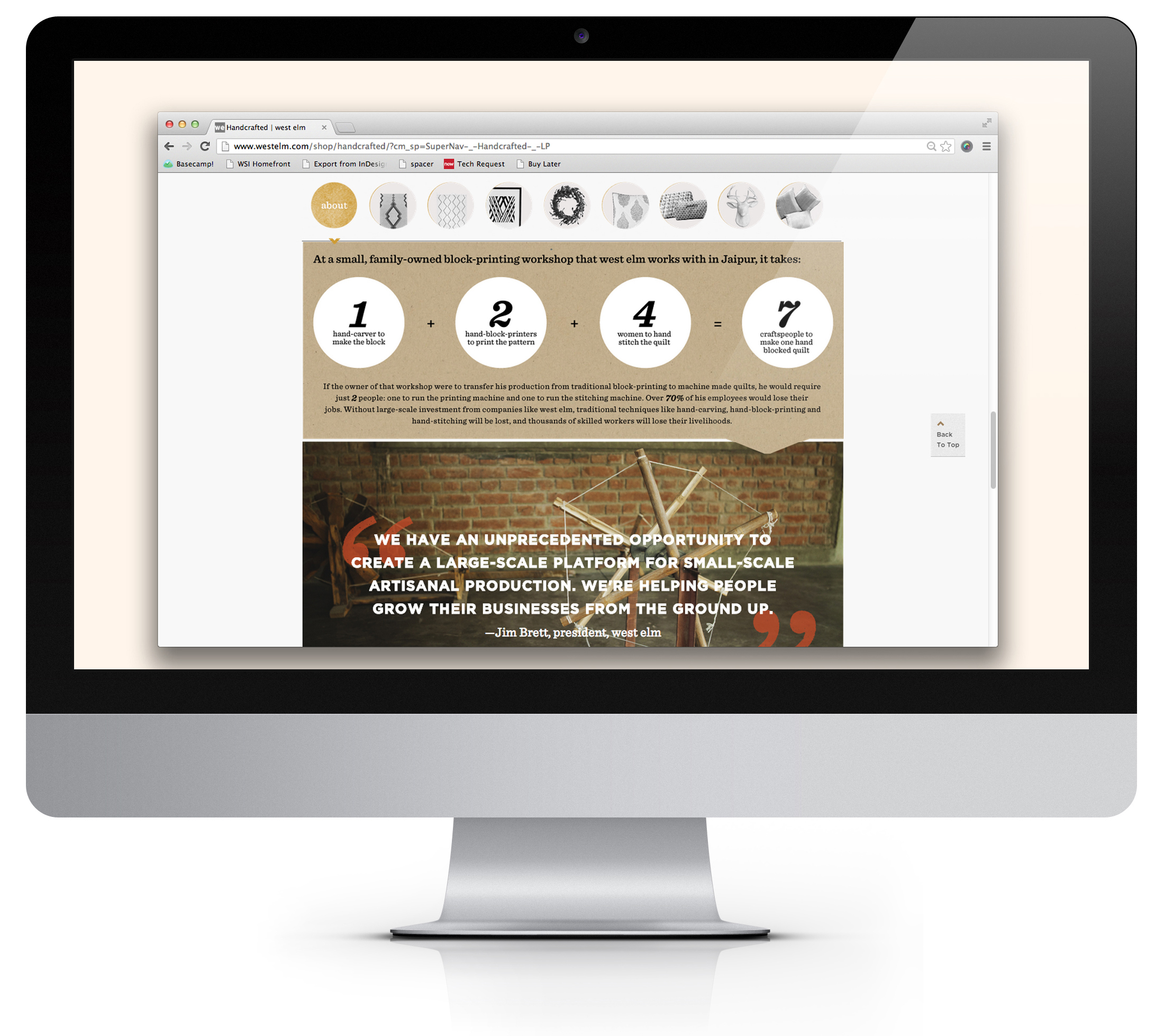
The launch of West Elm Handcrafted was West Elm's first attempt at a true 'advertorial' user experience, I was lucky enough to have been brought on for Art Direction and Design due to my editorial background. The Goal was to immerse the user in the story of the makers, allow for a non-intrusive purchase avenue, and also to engage them with exciting visual content, like on location photos & video. Click through for the entire Handcrafted micro-site


Typography, Design, Branding
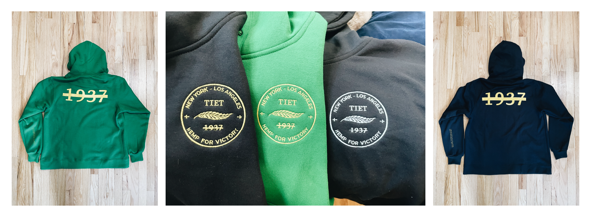
After an initial design phase in 2020 to begin sourcing investor capitol, TIET revisited this project with me to develop and design a full brand system and move beyond their initial “T” logo. With creative direction and collaboration with David Alvarez (Nike, Studio Alvarez, et. al.) we created the system seen below to usher in the next iteration of branding and direction for the company’s premier launch of cut & sew hemp goods.

Branding & Creative Direction
Cahuenga Valley Citrus Exchange approached the agency I was working at, as Treehouse Tavern, and after some vetting and research we highly recommended they consider dropping the naming convention due to the ambiguous nature of the name and competitors with similar names in the same market. After a research phase based on location and demographic we proposed the CVCE name convention based on the historic significance of the building they were situated in. From there I partnered with lead designer Kitty Mitchell and a small team of designers to created the custom citrus illustration you see below that blends both modern, geometric type with a more free-flowing illustration that borrows from woodcut stylings one might have found on citrus crates at the turn of the century.


Branding & Creative Direction
Mason Tiet approached me in early 2021 to give a visual voice to their new brand of hemp clothing & lifestyle items. The project is ongoing and includes the following logo mark, as well as a custom typeface, mascot illustration, and look + feel direction for Fall and Winter 2021 catalogs.

Poster Design
creative direction + Illustration

Creative Direction, Web & UX Design
Website & UX design for The Starlight Motor Inn, Charleston’s newest/oldest motor inn. Press Play!
Creative Direction, Branding,
Web & UX Design
The United States of Coffee began as a bit of a passion project and then launched as a Startup in early 2019. quickly amassing a following in the specialty coffee industry the brand is set up well to become what some have call the “Yelp For Great Coffee”


Additional support in the form of brand branch offs for podcasts as well as sound design, recording, and production.


Creative direction, Layout + Design
partnered with the local Acts 29 chapter to create direction and support materials for a regional conference

Acts 29 Regional Conference Poster
NRDC Website Layout + Design
When NRDC approached me to recreate their magazine onEarth in the digital space, I was more than excited. Not only did I have the chance to make a playground for great content I believed in, but it was also one of those projects that had a lot of problems but not yet many solutions. Ultimately I landed on a duel space that would house the digital magazine and its archives as well as daily content


Illustration + Brand Support
Partnering with one of NOLA’s hottest spots was a dream come true. To be able to assess The Elysian Bar brand, see the space, brainstorm with leadership and create new and unique illustrations that represent them, and who they are was one of my favorite projects from 2022.

Branding
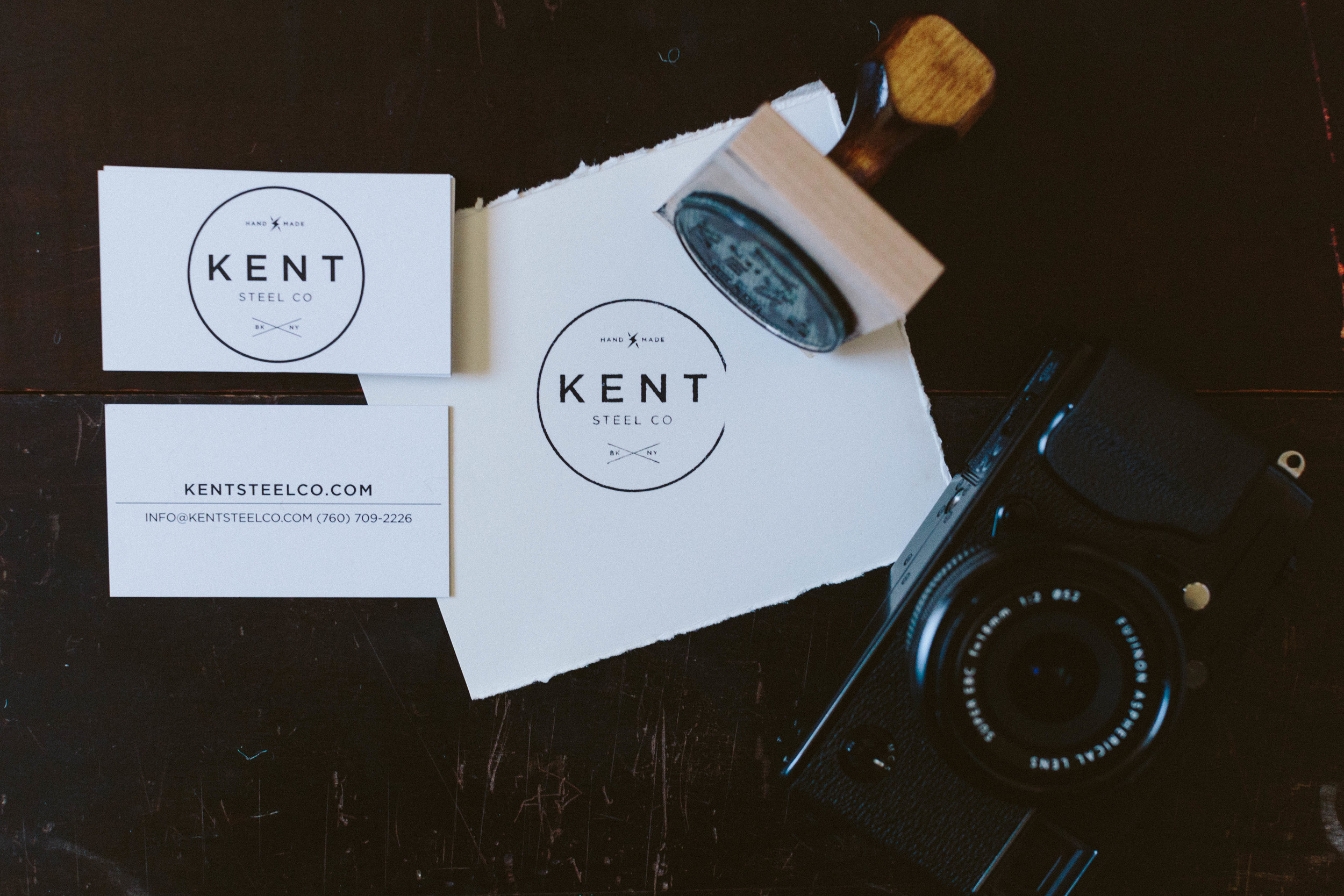
Kent Steel Co. Branding & Identity package

VINYL DESIGN + MERCH
Created for The Dependence Band and supported with stickers, magnets, posters and apparel.

Digital Design for music distribution
Book Design + Production
Jesus in the Life of Joseph was the seminal publication for Emergence Church. The church, based in the North East serves nearly 3,000 congregants and wanted to create a resource that would coincide with a 10-week lesson plan. The concept, for the work to be equal parts study guide, interactive lesson plan and a real-time road map through the spoken content was not only designed but also produced by my team, in-house. This presented a number of challenges, which are not limited to: managing a 3 person editorial and fact checking team, a 4 person art team as well as a 15 person production crew. The results were stunning.


Creative Direction + Branding
When Brandon Grimlia of Promises Kept reached out early in the startup phase I was beyond excited to get to work with him and his team. The goal was to make a branding system that captured their fun, bold style but could also cleanly work to establish professionalism on the web, social, and on menus, matchbooks and to-go containers. Offsetting the illustration content with a clean single-line weight style was helpful as was the choice to employ Brandon Grotesque for the base type.


Blog Creative Direction

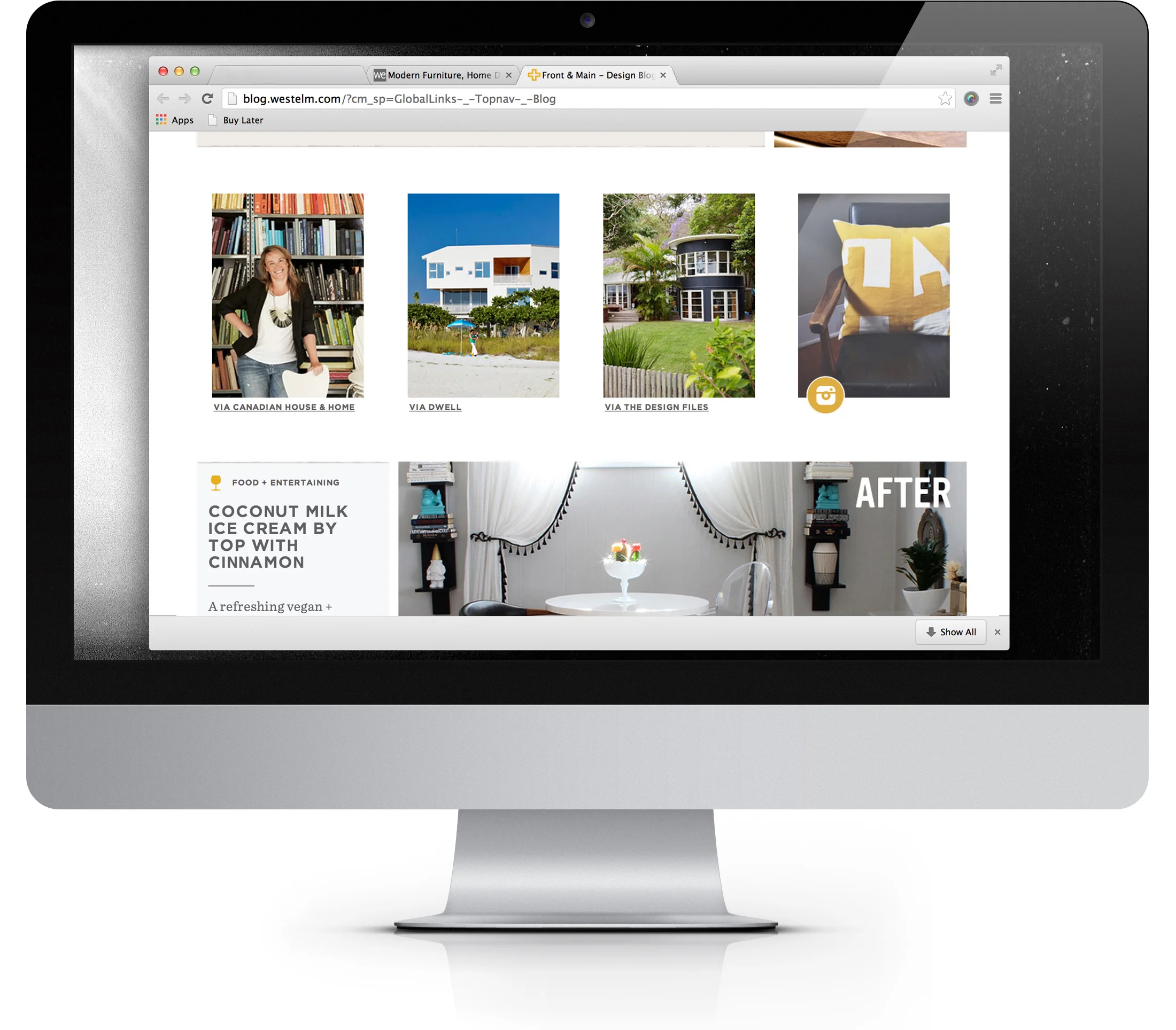
Front + Main solved a long running problem at West Elm: 'Where do we put all this amazing content, without it being overwhelming?' Art Directing this project was a delight as we got to discuss and ultimately solve questions like: 'What content should be paired together?' And, 'How can color serve to create our grid?' Working with designer Dominic Fortunato on this project made directing the easiest part of the process.
Creative Direction + Branding
In early 2020 and Inc 500 brand Christian Planner was coming off their blockbuster kickoff year with over 8 million in sales but they had done this on the back of a product and a dedicated following, not a brand. This project involved 3 months of consulting with the Founder, CFO and CMO to help Christian Planner realized not only what their logo should look like, but who they were as a team in beliefs, look + feel, and voice.


